NEWS!
Refreshing TBLS brand
In summer 2020, The Table became The Brand Language Studio. For two years, we’ve been establishing our brand and (re)growing our business. We’re delighted to share our refined look, including neater icon, new Articles and Workshops web pages, and – we hope – all round better experience for you, our visitor. Our founder Rob takes you through the changes.

Losing The Table in a trade mark dispute felt hard and unfair at the time. But two years on, I can see it was the shock we needed.
Established in 2015, The Table launched when I won three big clients. Over five years, it grew – through many more tone of voice projects, brand positioning pieces, training, consulting, and plenty of writing. I didn’t realise, but by 2020 it was time for a change.
When we relaunched as The Brand Language Studio, I wanted to create a brand full of colour – to reflect the energy we bring to brand language projects. Karina Stolf helped us to do exactly that. But our launch website in particular was designed to serve us for a short time. I promised myself we’d update it when work got busier.
As the pandemic eases, work is picking up. We’ve recently supported brands including ARgENTUM, Hope and Homes for Children and ARU with their verbal identity; and today we support brilliant agencies like me&dave, psLondon and Falcon Windsor.
Here’s what we’ve done to refresh and refine our website:
Featured imagery
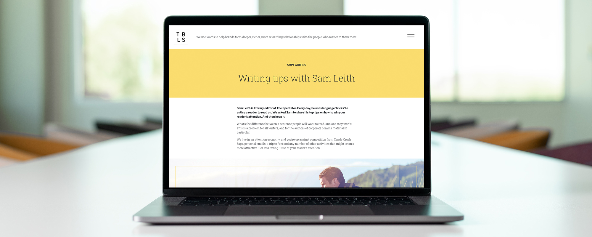
Where once articles looked like a book spread, with standfirst (left) and body copy (right) on a plain background, the redesign borrows from magazines. An image now catches the eye and sets the tone.
Owned our keyline

Our logo and icon feature our brand name and initials within a fine border. Our designer Karina suggested we use this border, or ‘keyline’, to shine a light on important subjects, in our visuals and writing.
Embraced simplicity
Our website’s footer was getting messy, with Privacy note, contact details and social buttons sitting uncomfortably. We’ve stripped it back so it’s cleaner to look at and easier to follow.
Given more guidance
We now have a richer text editor, giving us control over every element of articles, including headers, sub-headers, imagery, quotes and feature text. Which helps us to smooth our visitors' experience.
We shout less
Our URL is our name. So why repeat that name so often in the site’s header? We now use our initials icon, and have reduced our intro text to let the content below demonstrate what we do.
We’re delighted with how it’s worked out. And forever grateful to Karina and our web genius Mark for making it happen. As we grow, we’ll continue to refine in the name of user experience.
